We are in love with the idea of "branding" a wedding. It is so much fun and such a special project for us to come up with a wedding monogram that really speaks of who the couple is, something that reflects their unique personalities and special story - what makes them them. The great thing about a really unique wedding monogram is that it can become a family crest of sorts... even being carried through the years and used on special occasions, perhaps even adding children's initials as your family grows!
A wedding monogram can be used in all sorts of ways, on a save-the-date, invitation, and carried through all the wedding stationery. It can be printed on favor tags, cocktail napkins, (LOVE!) and even as a light shone on the dance floor or a wall at the reception (trés chic!).
A wedding monogram doesn't have to be used on absolutely everything... in fact, we have found that it can work equally well as the main piece of art or as a classy detail. For example, you may have a damask theme running through your printed materials, but use your monogram as a seal for the envelope, on a card in gift baskets for out-of-town guests, on cocktail napkins, and as a dance floor light image. That way it works as a special and sophisticated detail but is not overly matchy-matchy. Your guests are sure to be impressed!
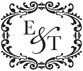
Erica and Timothy had a very formal black and white wedding and used their wedding monogram to adorn their wedding invitation set, program, place cards, menu, and table numbers.
Christy and Michael are planning a beach wedding in San Diego, California and have a seashell theme running through their wedding stationery. We created this logo for them and they will be using it on a cuff around their invitation, on their custom stamps, and on gift tags for their favors.

Adam and Rachel wanted a very simple but graphic monogram that they could use in the upper left corner of all their wedding stationery and day-of details. We used a strong, serif A for Adam's initial and a fancier "girly" script for Rachel's initial. They used it in their wedding colors, alternating the logo in plum and orange.

What kind of graphic designer are you? You should be ashamed of your shoddy work.
ReplyDeleteFirst, nice job ripping off the Shell logo. I mean, damn, you didn't even bother changing the number of grooves running through it. Fabulous! I know I'd be happy to have a gasoline company's logo on my wedding invitations. Real classy. (And a quick shout-out to New York for finally legalizing my right to marry! Hollah!)
Next, your typography flat-out sucks. Holy shit, *zero* attention to detail. You didn't even get the stupid kerning right. And Copperplate Gothic, of all things? You put goddamn Copperplate Gothic on wedding stationery? Dear, that typeface belongs in banks, and even then, only old stodgy banks with Victorian or Prairie Style architecture.
I'm not even going to touch on the way you mix roman and script typefaces. And Oh. My. Gawd! You even used text typefaces where you should've picked display typefaces. Those slabs are like freaking bricks. That goes for both your first and third examples. I mean, seriously, if you're going for a Didot sort of typeface, at least make sure the serifs and horizontal strokes taper to a hairline.
ar
ReplyDeletear
ReplyDeletedesign own logoDesigning of a Logo has become very essential as it is a symbolic representation of your company in terms of vision, value and objectives and also it's your first positive impression on your customers
ReplyDelete